



You know the dashboard is not working when everyone is looking at it, and the next question is still, "So what do we do?"
It happens in SOC reviews. It happens in leadership updates. It happens when an analyst opens a view during an investigation and spends the first few minutes figuring out what the page is trying to say.
The dashboard is not empty. That is not the problem. It has the needed alerts, detections, vulnerabilities, identities, cloud activity, network traffic, compliance, exposure, and plenty of charts. The numbers move. The filters work. The page may even be technically correct.
But the decision is still somewhere else.
Someone has to interpret the pattern. Someone has to know whether the number is good or bad. Someone has to decide whether this is noise, drift, a control failure, or something worth investigating now.
That is the quiet failure of many security dashboards. They do not fail because they lack data; they fail because they make the user finish the thinking.
Most security dashboards are built backwards. They start with the data: What can we query? What can we visualize? Which chart should we use? Which metrics should we include?
A better dashboard starts with the decision: Who is this for, what are they trying to understand, and what should become easier after they look at it?
Security teams already have more data than anyone can read. Network tools, identity providers, endpoint agents, cloud platforms, firewalls, and SaaS applications all produce signals. At Vectra AI, we parse more than 8TB of modern network activity every second. Add the rest of the modern security estate, and the problem becomes obvious: getting the data is not the hard part.
The hard part is turning that data into something a person can understand quickly enough to act. If a dashboard cannot help analysts answer what to do next, it is not giving insight. It is handing the analysis back to the reader.
Dashboards Are User Experiences, Not Data Containers
A dashboard is an experience someone enters under pressure.
An analyst may be deciding whether an alert is noise. A manager may be checking whether a control is working. A leader may be trying to understand whether risk is moving in the right direction.
Those people may care about the same environment, but they do not need the same view. When teams design a dashboard for the organization instead of the user, every stakeholder gets a metric, and every data source gets a widget. The page fills up. It feels comprehensive, but nobody can tell what matters first.
A good dashboard user experience starts with a sharper question: Who is this for, and what decision are they trying to make?
Not Every Security Problem Should Become an Alert
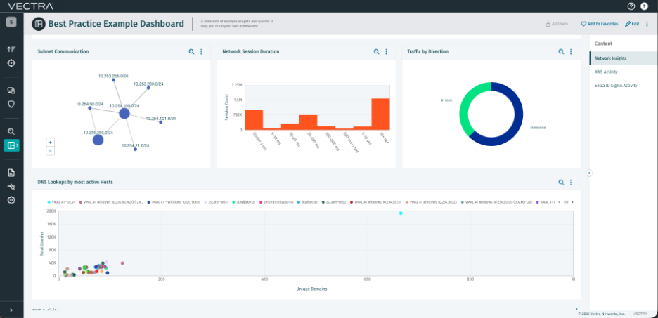
The security industry has a familiar way of making data actionable: generate an alert. That works when an event is important, rare, and owned by a team that can respond. It works less well when the problem is not one event. Sometimes the real problem is the shape of the environment.
For example, network segmentation.
A team may want to know whether two isolated parts of the network are communicating. One option is to create a ticket every time a host crosses a restricted boundary.
If this happens once a week, that ticket may help.
If it happens 1,000 times a day, 1,000 tickets do not make the organization 1,000 times more secure. They give an already busy team a queue of repetitive work without helping them understand whether the boundary is failing in one place, failing everywhere, or mostly working with a few meaningful exceptions.
A dashboard can tell a better story. It can show that one segmentation boundary is failing broadly, another has only a few suspicious exceptions, and several others appear to be holding. In a single view, the team can see a systemic control problem, a small number of events worth investigating, and evidence that some controls are working as intended.
The decision changes. Instead of asking, "Which alert should I triage next?" the team can ask, "Which control needs attention first?"
That is the difference between observing security events and understanding security posture.
The Common Dashboard Traps
Bad dashboards are not always obvious. Some of the worst ones look impressive.
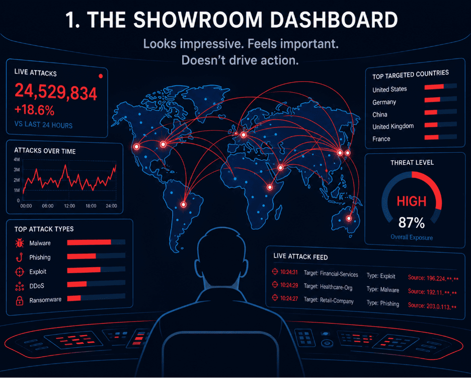
There is the stereotypical showroom dashboard: a globe, moving lines, flashing numbers, and enough animation to make visitors feel like something serious is happening. It looks alive. But if nobody changes a decision after looking at it, it is decoration.
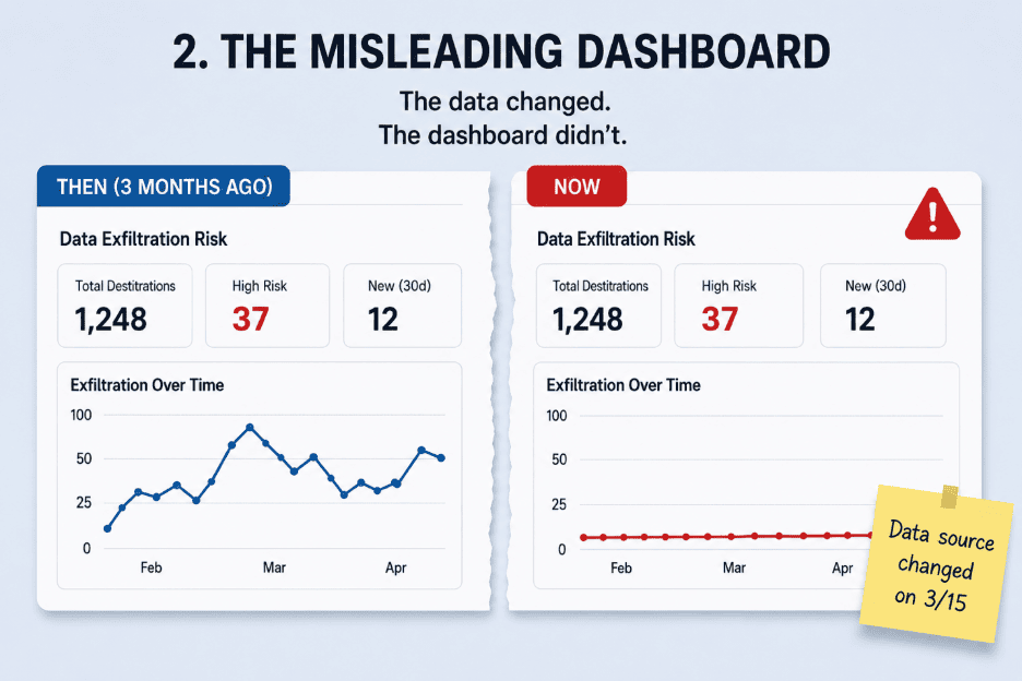
There is the misleader: a dashboard that was once correct but quietly drifted. A field changes. A data source stops reporting. A naming convention evolves. The charts still render, but the dashboard no longer shows what people think it shows. Visual confidence can make stale data feel more trustworthy, not less.
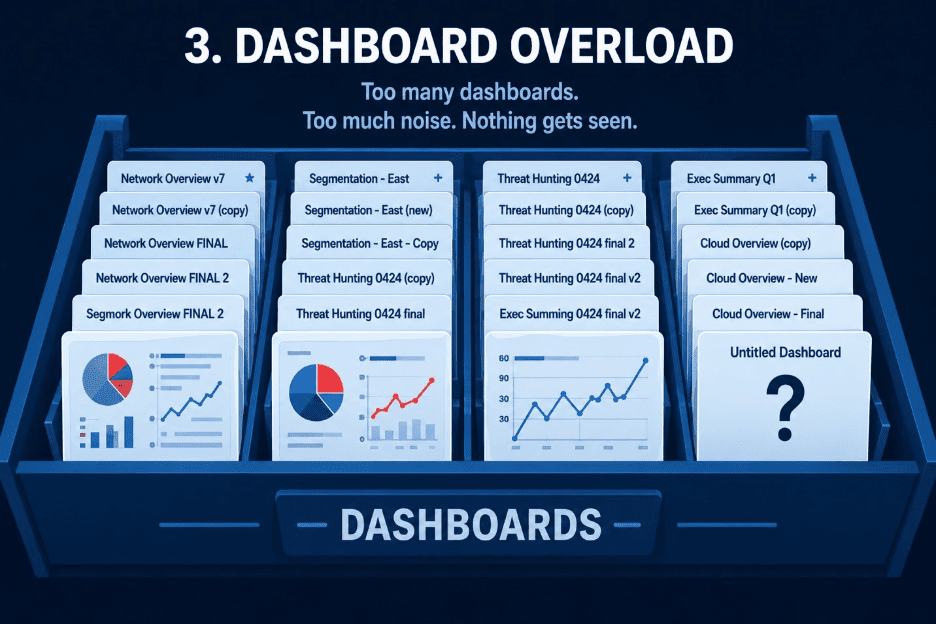
There is the overload: 200 dashboards, half-duplicates, old investigation views, abandoned experiments, and names like "Copy of Critical Insights." The problem is no longer visibility. It is findability, ownership, and trust.
And there is the orphan: a dashboard that reveals a real problem, but nobody owns the review, interpretation, or next step. A dashboard does not improve security merely by existing. Someone has to care about the question it answers and have a way to act when the answer changes.
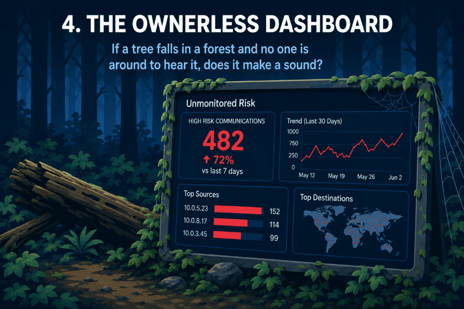
Each failure has the same root cause: the dashboard was treated as a place to put information instead of a product experience that supports a decision.
Context Turns Numbers Into Decisions
A number without context leaves the reader guessing: Is this high or low? Is it getting better or worse? Compared with what? Does it require action now?
That is why UX writing matters in dashboards. Labels, section names, helper text, descriptions, and empty states are not decoration. They teach the user how to read the page.
A useful dashboard does more than show detection volume. It explains whether the volume changed. It shows where the change is concentrated. It gives the user a way to move from a summary into investigation. It uses rich text to explain what to look for, why it matters, and what to do next.
Before adding a widget, ask: What decision becomes easier because this is here?
If the answer is unclear, the widget probably does not belong.
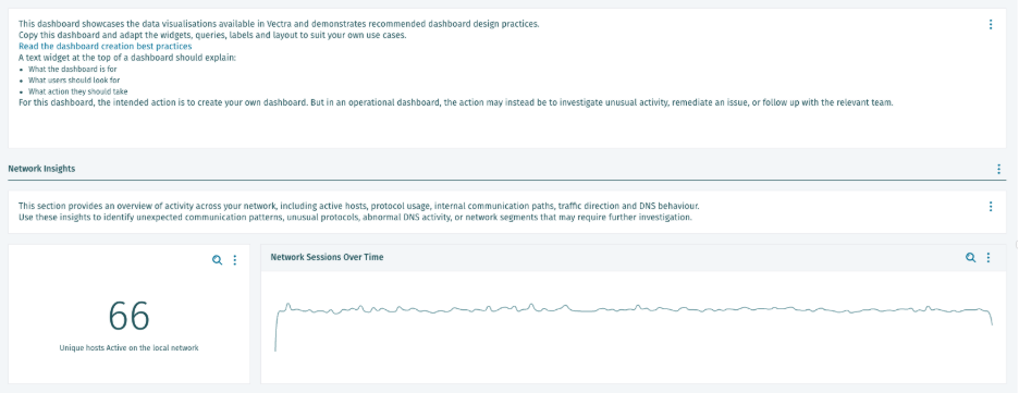
Build Around Questions, Not Queries
The best dashboards do not start with, "What can we visualize?"
They start with questions like:
- Which systems are crossing boundaries that should be enforced?
- Where is unexpected activity appearing across network, cloud, and identity data?
- Which AI services and applications are being used in the environment?
- Are the controls we invested in producing the outcome we expected?
Once the question is clear, the structure follows.
Put the primary answer first. Show current posture next. Use trends to explain whether conditions are improving or worsening. Show where the team should focus. Put investigation tables lower, where they support action instead of forcing the user to interpret raw evidence first.
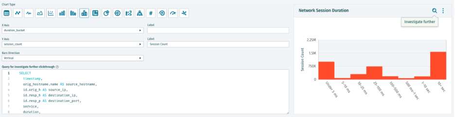
This is also where AI can change the workflow. If a user can describe the question in plain language, AI-assisted widget creation can help turn that question into the query behind the widget. The user still owns the decision and the interpretation, but they do not have to start with a blank SQL editor.
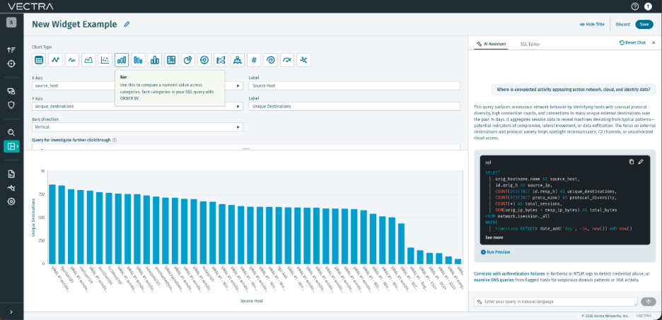
Choose the visualization last.
Line charts show change over time. Bar charts compare categories. Single values show status. Tables support investigation. Rich text provides context, playbook guidance, links, and escalation criteria.
The chart type is not the point. The decision is the point.
The Goal Is Not Another Dashboard
Security teams do not need dashboards because the world is short on charts.
They need dashboards because some questions are too broad for a single alert and too complex for raw data. A good dashboard is the middle ground. It helps a person perceive a pattern, understand the scale of a problem, and focus action where it will have the greatest effect.
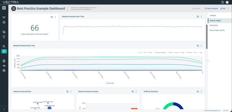
Vectra AI’s custom dashboards support that by bringing network, identity, cloud, and threat data into views that teams can shape around their own environment. AI-assisted widget creation helps teams turn plain-language security questions into the queries that power useful widgets, then refine those queries as needed. Rich text context and investigation paths help turn the view into a workflow, not just a report.
The best dashboard is not the one with the most widgets. It is the one that helps a team see where risk is changing, where controls are holding, and where investigation will have the greatest effect.
When dashboards start with the decision, they stop being decoration and become part of the security workflow.
For practical guidance on structure, widget selection, rich text context, and investigation setup, see the Dashboard creation best practices guide.